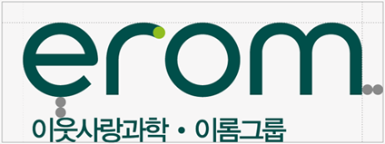
The logo of Erom Group consists of the brand name 'erom' in lowercase English and 'Science for Neighborliness Erom Group' in Korean.
The current lettermark design reflects the future value of FOOD, DEVICE, PLATFORM of Erom Group, which has grown into a food company responsible for immune health, and is designed in consideration of the way the human eye recognises visual signals.
By delicately adjusting the space between letters and rows, the lettermark has a harmonious visual balance that is close to nature.
The lettermark, which was created with a sophisticated and visually balanced typographic design, provides the management philosophy of Erom Group, which leads innovation and constantly challenges for a healthy tomorrow.

To convey the image of a food company responsible for immune health, Erom Group started using a stylish lettermark logo.
As the use of the lettermark gradually expanded across all group companies, it was upgraded to the current, more refined design.

The space around the lettermark should always remain empty to prevent other elements from encroaching on it.
See how the brand colours are applied to the lettermark.


Apply a consistent icon to the product information.